Step 12: Shell Control as Container
Now we use a shell control as container for our app and use it as our new root element. The shell takes care of visual adaptation of the application to the device’s screen size by introducing a so-called letterbox on desktop screens.
Preview
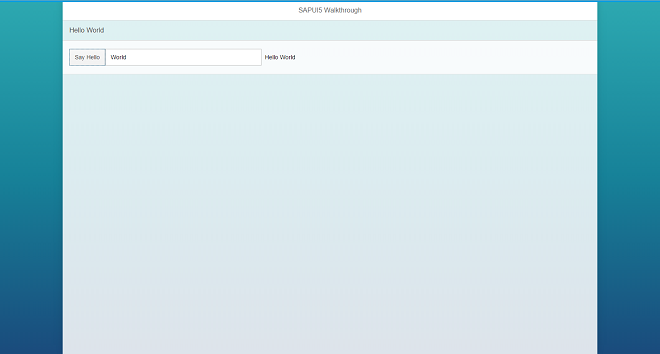
The app is now run in a shell that limits the app width
Coding
You can view and download all files in the Explored app in the Demo Kit at Walkthrough - Step 12.
webapp/index.html
#!html<!DOCTYPE html>
<html>
   <head>
      …
      <script>
         sap.ui.getCore().attachInit(function () {
            new sap.m.Shell({
               app : new sap.ui.core.ComponentContainer({
                  name : "sap.ui.demo.wt",
                  height : "100%"
               })
            }).placeAt("content");
         });
      </script>
   </head>
   <body class="sapUiBody" id="content">
   </body>
</html>
The shell control is now the outermost control of our app and automatically displays a so-called letterbox, if the screen size is larger than a
certain width, all we need to do is to assign our component to the aggregation app of the shell.
Note
We do not add the Shell control to the declarative UI definition in the XML view, because apps that run in an external shell, like the SAP Fiori launchpad, there will already be a shell around the component UI.
There are further options to customize the shell, like setting a custom background image or color and setting a custom logo. Check the related API reference for more details.